One of the most powerful tools in a communications team’s arsenal is the call to action (CTA). When used effectively, CTAs are the backbone of a communications strategy, helping to educate your audience and drive them to engage with you in return.
Not just for consumer marketing campaigns, CTAs are an invaluable – if often underutilized – tool for government agencies.
What is a call to action?
A call to action is a prompt on any communications channel – webpage, social post, email, brochure, video, etc. – that urges the reader to take a specific action.
Learn more. Submit a comment. Register today!
Used effectively, CTAs define the customer journey and shape your audience’s experience. Building these CTAs with a strategy that centers around the user helps to anticipate and meet audience goals, thereby building trust and engagement.
For government, CTAs can make the difference between merely delivering information versus promoting effective action. While directly promoting action requires more strategy and effort, it’s also more effective in engaging stakeholders.
Know your audience, know your channel
The foundation of a compelling CTA lies in understanding your audience – what they want or need – and the communications channel you’re using.
In our work with the Office of the National Coordinator for Health Information Technology (ONC), we communicate with a large variety of stakeholders, including the general public. When crafting CTAs for ONC’s many channels, we consider audience and behavioral metrics.
For example, visitors to HealthIT.gov frequently arrive via Google search, which means their level of familiarity could range from low to high. In contrast, newsletter subscribers have already signaled awareness of ONC programs and are ready to engage more deeply with agency content. To best serve these different audiences, web CTAs aim higher in the engagement funnel than newsletter CTAs.
Build the audience journey
By anticipating the audience’s needs, agencies can build journeys that guide readers to deeper engagement. For each piece of content, define the next most beneficial action the reader can take. And the second, third, and fourth steps after that.
That’s how you build a journey.

For example, when disseminating information about proposed rules, the goal is often to solicit public comments. But before readers can do so, they must understand the rule, which could be hundreds of pages of dense policy language.
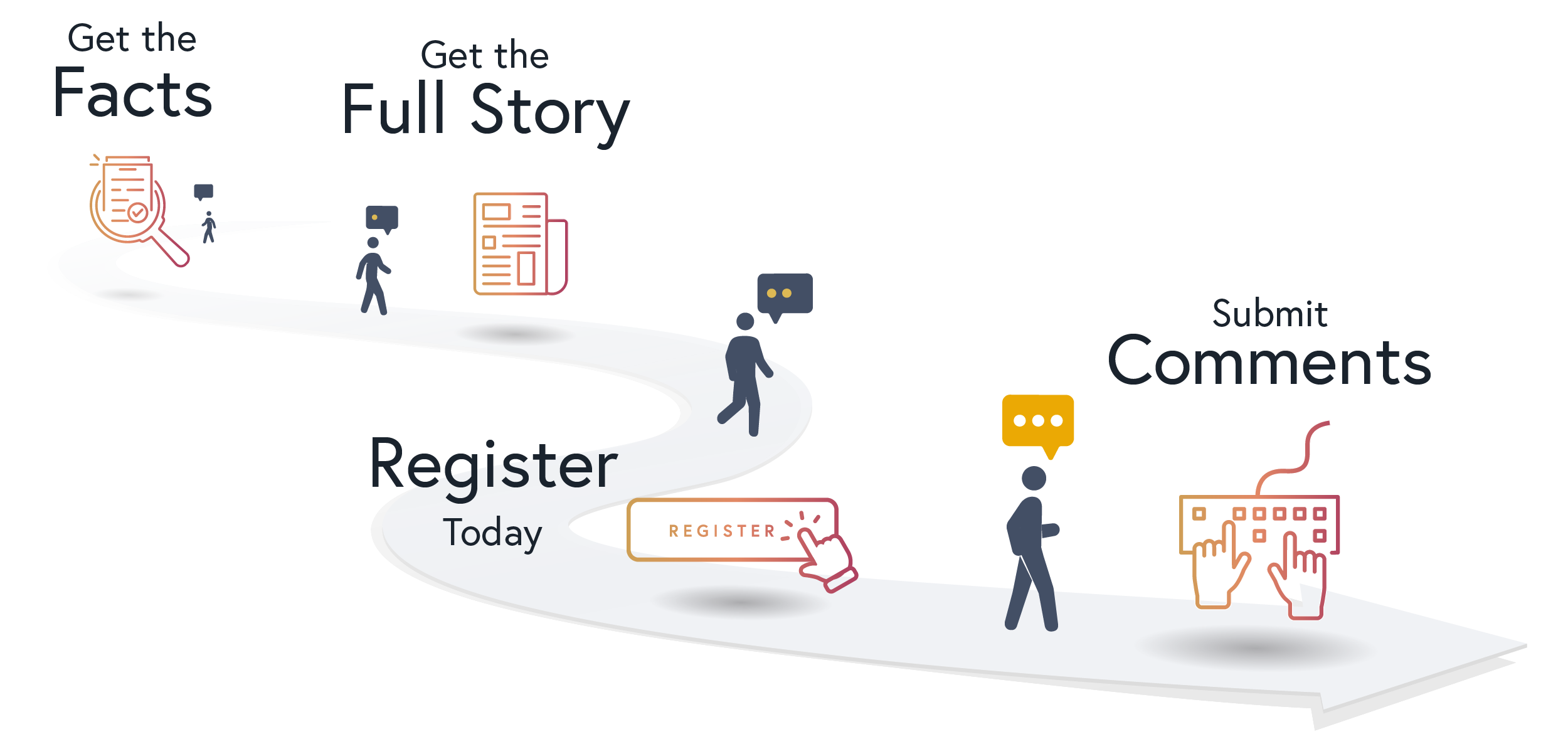
In this case, the journey might begin with a primary CTA to Get the facts, which drives readers to a digestible fact sheet. The fact sheet CTA – Learn more or Get the full story – might send readers to online content with more detailed messaging. Readers who consume this content are likely to have sufficient familiarity to formulate specific questions. Anticipating this need, the next CTA guides readers to a webinar and invites them to comment on the rule.
Multiple audiences, multiple paths
Federal agencies communicate with a wide range of audiences who encounter your content at different phases in their journey. For example, an agency webpage serves first-time visitors looking for basic information as well as industry stakeholders and Congressional staffers who want the latest update.
If a landing page, newsletter, or other key piece of content offers only one choice, some readers are likely to abandon the journey entirely. To avoid the risk of abandonment, a secondary CTA creates an alternate path for users who aren’t ready to engage with the primary CTA.
Let’s say we want to promote an upcoming policy Q&A. A primary CTA – Register today! – serves experienced stakeholders who already have a deep background and have questions ready. For those less familiar with the policy, a secondary CTA might promote a relevant blog post or infographic that better meets their needs.
Drive clicks and build trust with microcopy
Motivating readers to click a CTA takes more than a button with some anchor text. It almost always requires context. Depending on the channel, providing that context requires a combination of design and microcopy – for example, subheads on a landing page, default text in a search field, or a brief social post.
Microcopy serves as a signpost that orients readers to the CTA, sets expectations, and tees up one or more click-worthy benefits to the reader. With strong microcopy, agencies can build trust and establish a foundation for further engagement.
For government, CTAs can make the difference between merely delivering information versus promoting effective action.
Unlocking the full potential of CTAs
When crafted thoughtfully, CTAs are much more than just buttons and links. They’re an integral aspect of an agency’s communications strategy. Combined with the power of design, they engage audiences at the opportune moment for greater involvement in policy, programs, and initiatives.
Because they guide readers through the journey to fulfilling their own needs, CTAs hold the key to achieving your organizational mission.
Ready to get your readers to take action? Check out our writing and editing and web design services.


