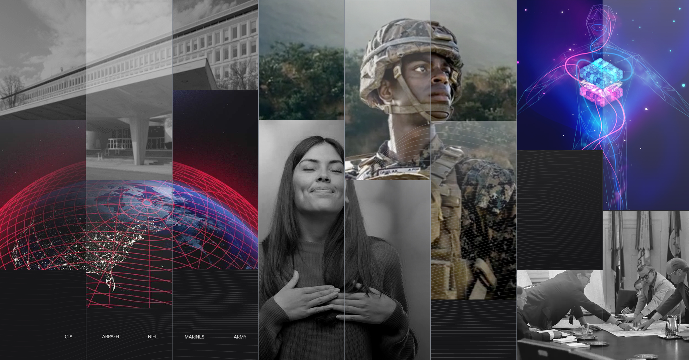
Back in the 1970s, the federal government got a crash course in the power of design.
Under a nine-year initiative known as the Federal Graphics Improvement Program, the National Endowment for the Arts (NEA) engaged major design talent to overhaul the public face of our nation. They convened “design assemblies” for leaders and bureaucrats and produced a report called The Design Necessity that highlighted 10 ways – with examples – of how design improved government.
Visual communication was a key focus area, and 45 agencies got new logos and design systems. Some of them – like the NASA worm and USPS eagle – are still in use today.
It’s a great story.
40 years later…
After the program ended, the federal appetite for design faded. Over time, many agencies developed a resistance to producing materials that looked “too fancy” because it might be perceived as wasting taxpayer dollars.
If the ‘70s were the Golden Age of government design, what followed was notably duller. While it’s entirely appropriate for federal leaders to carefully manage budgets and public perceptions about their spending, the fear of “too fancy” left some agencies at a loss.
The overall image of government declined, especially as the private sector continued to embrace strong branding and dynamic design. Vital programs struggled to compete for attention in increasingly noisy markets.
Fast forward to today: The 21st Century IDEA Act is turning six. The U.S. Web Design System has nine years in service. And once again, the White House explicitly connected the federal customer experience to trust in government.
Good design has returned to government, and agencies are increasingly using it to reinvigorate their reputation as service providers, employers, and engines of innovation. While government agencies aren’t overtly “selling” products or services, they are selling citizen services – and how those services are communicated and packaged matters.
What do we mean by design?
When communicators invoke the power of design, often they’re referring to either its functional value (as in user experience) or its process value (as in design thinking). But design also refers to aesthetics – that is, how something appeals to the senses.
The power of design aesthetics is equally vital to government communications. A strong design can capture attention and positively influence public perception of the message and the messenger.
What design can do for government communications
- Capture attention
- Create a positive first impression
- Spark recognition
- Strengthen emotional connection
- Inspire trust
- Compel action
- Signal empathy
- Convey quality
Five examples of great design in government today
1. Appealing to a generation raised on bold design and digital media
Many government agencies must appeal to a young demographic. That means competing with sophisticated commercial marketing campaigns.
The U.S. Army regularly upfits its design aesthetic to capture attention on the channels where their target audience spends the most time, often using video as the means to tell compelling stories.
2. Branding with purpose
Design evokes emotion. For federal agencies, design can deepen impact by helping citizens to grasp a program’s significance, gain trust, and take action.
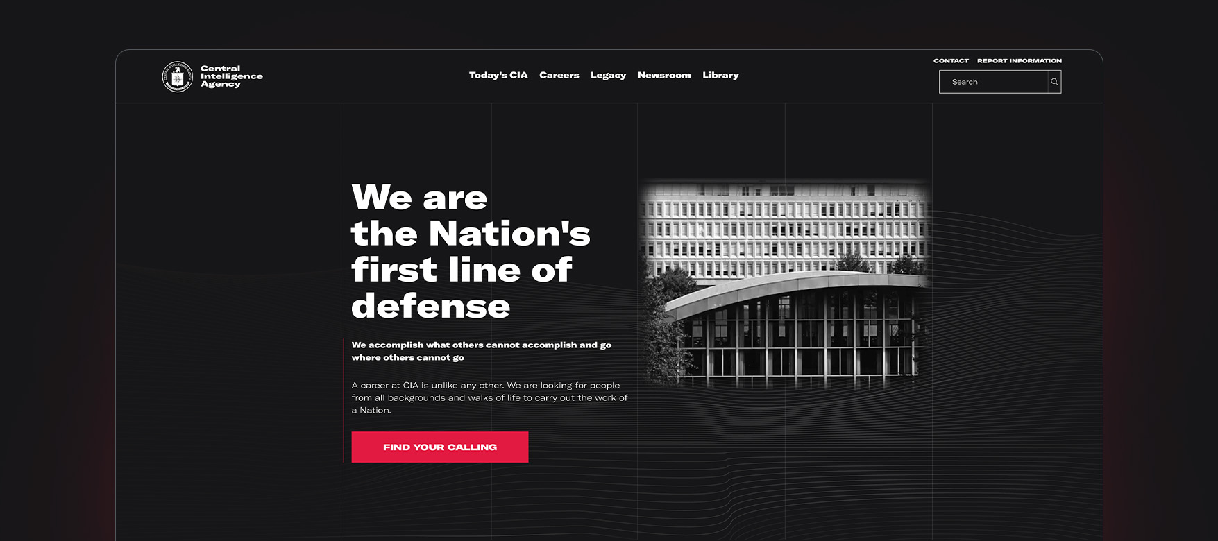
The CIA has effectively established a modern tone for intelligence gathering through a sleek, user-friendly experience that is both stylish and accessible. By incorporating subtle distortions and textures in the imagery, they create an element of intrigue.
3. Changing behavior
For agencies whose messaging must reach and influence the general public, a commercial design aesthetic helps attract attention on social media and other visually noisy spaces.
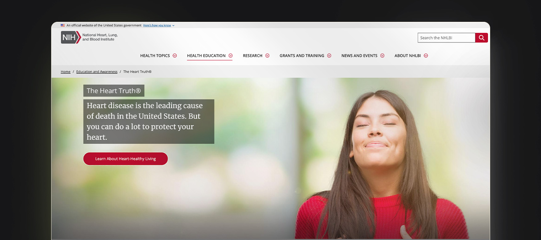
An outstanding example is “The Heart Truth,” a public health campaign led by the National Heart, Lung, and Blood Institute. The campaign’s signature visual – a red dress with a cutout heart – is iconic and instantly recognizable.
4. Exemplifying innovation
At the Advanced Research Projects Agency for Health (ARPA-H), each program starts with a challenge deemed unsolvable by traditional health care approaches. The agency is tasked with funding ideas so bold that no one else is willing to take them on.
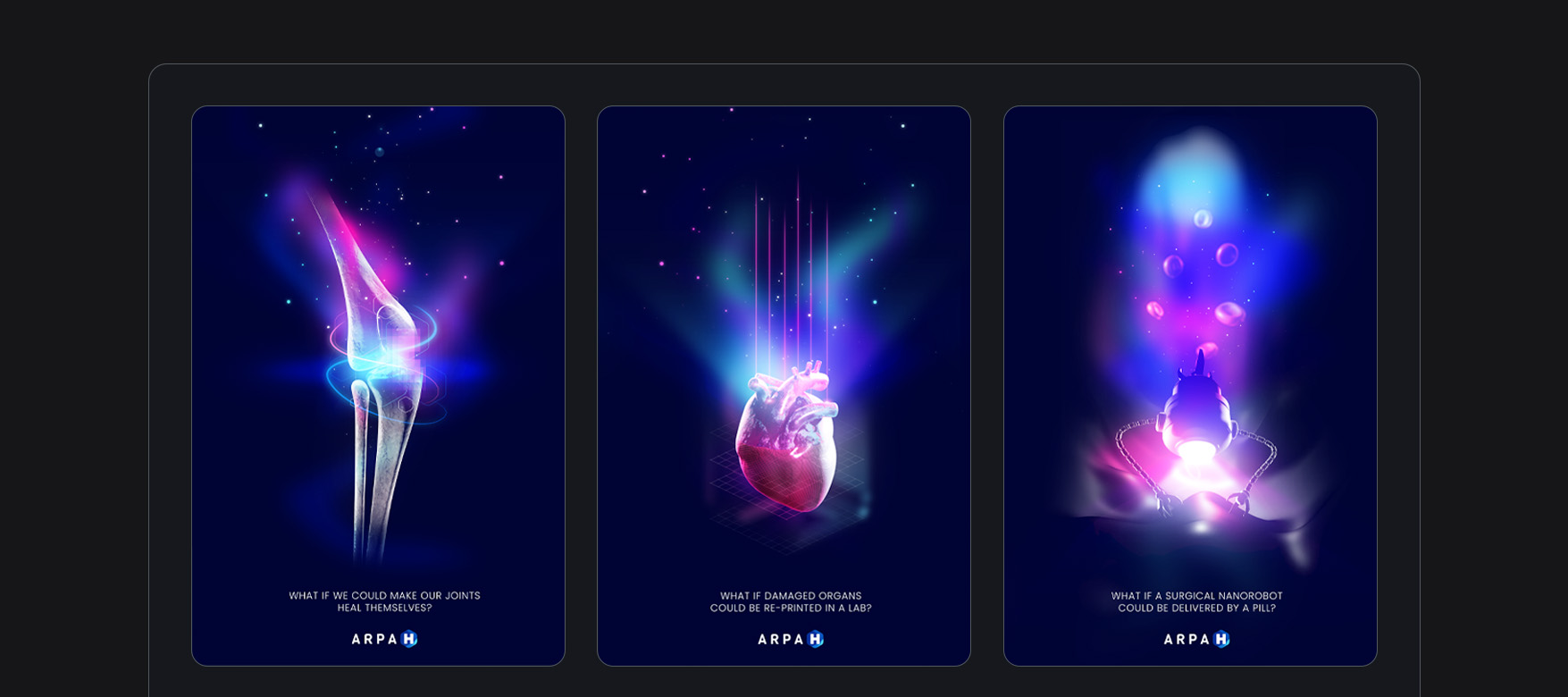
To convey that kind of daring innovation, ARPA-H created a suite of posters that apply a technical edge to diagrams and anatomy visuals using vivid colors, ambient glows, and far less text than we typically expect from government.
5. Boosting employer branding and recruiting
Attracting and retaining top talent is critical for government agencies. Many are embracing the concept of employer branding to inspire employees and communicate their employee value proposition.
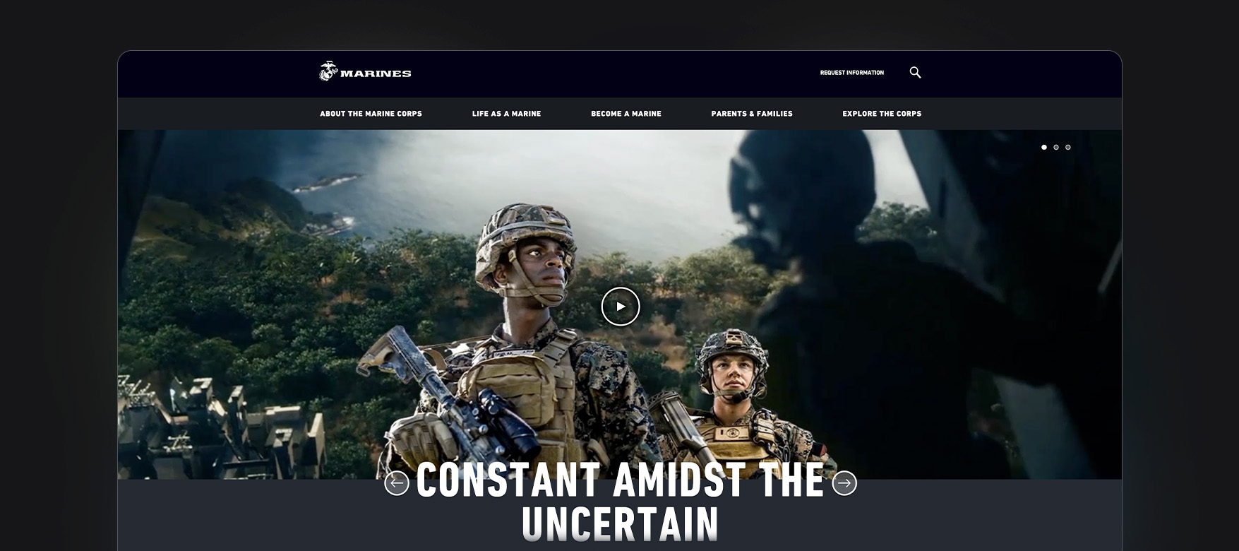
One powerful example is the U.S. Marine Corps recruiting website. The Corps uses a strong grid and powerful photos to convey the values, benefits, and commitment shared by all Marines.
Perception is reality
To paraphrase the inspired leaders who developed The Design Necessity, how things look leaves you with a visceral impression of how they will work. Federal missions need communications that “speak” with visual authority. They need designs that attract, engage, and delight. And they need consistent and cost-effective implementation.
At Spire, we delight in the opportunity to put design to work for the public good. Learn more about our branding and graphic design services and see a few of our designs in action!


